LoneTreeFarms
Idiot
- Joined
- Jan 12, 2011
- Messages
- 156
- Reaction score
- 58
I like the label but love the backstory that goes along with it. it makes it special and unique and a story to tell to all you share it with! cheers


Can you tell us a little more about your Valpolicella Ripasso? Was that a kit?
28 Days Later is the title to a fairly recent Zombie movie.
Thanks so much Toddo! I'm in Ontario so I have access to the lcbo! It looks like good wine! Love the bottles! Have to get my hands on some!
Rayway your labels are great too!
Carolyn
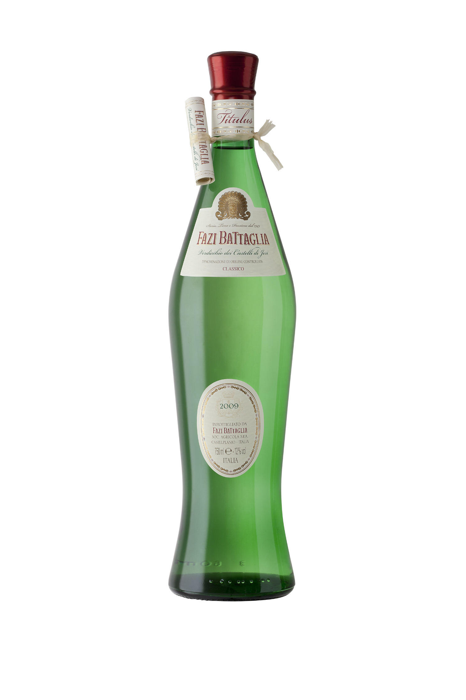
The curvy bottles are the brand "FAZI BATTAGLIA" available at my local LCBOs http://lcbo.com/lcbo-ear/lcbo/product/details.do?language=EN&itemNumber=24422
A couple more.....I am a long way away from bottling anything but making labels has been giving me something to do while my 2 year old son sits on my lap watching Thomas the Train on Youtube.
All labels made from photos I took:


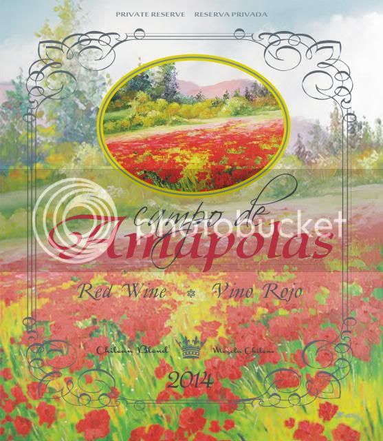
I think it is an attractive and creative label.
If you are going to use this eventually as a commercial label for a licensed taxed product, I think the TTB will not like the gov warning to be obscured by the art underneath it. I think it has to be clear and easily readable.
Also, no need for a shellfish warning as you can't use shellfish derived chitosan commercially. I think you can only use chitosan from fungal origins.
Sent from my iPad using Wine Making
Ok so I decided to redesign the Merlot back label
I had created a while back
Tell me what you really think

Enter your email address to join:
