Opinions Please...

Winemaking Talk - Winemaking Forum

Help Support Winemaking Talk - Winemaking Forum:

This site may earn a commission from merchant affiliate links, including eBay, Amazon, and others.
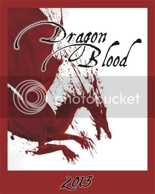
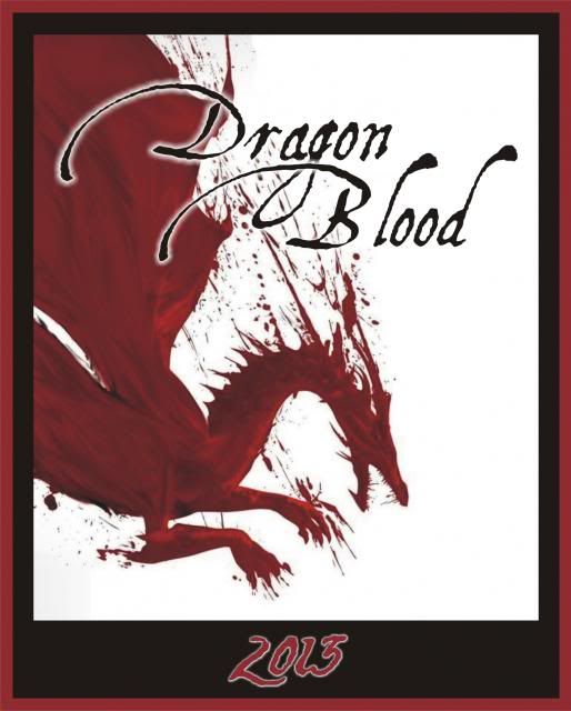
First off, great job on all of them. In order of preference, #3, #1, #5, #4, and #2. I agree with someone else that #1 needs a slightly darker background but so dark as to mess up the grey shadowing. I might put #5 at the top if the dragon was more prominent.
 
Looks like a fun exercise, I'm just not sure you've beat your original design well enough to switch yet. I'd be glad to take a look at your original file for #1 and make it editable or edit it for you and send it back, might make a big difference.

Design is like winemaking sometimes - Patience pays off big time.

I like #3 if I was choosing though.
Mike
 
Manthing is a graphic artist by trade.
We both agree on the following....

Graphics on #1, just the dragon w/o the warrior in the background.

Dragonblood on the font from #5.

Simple and uncomplicated with visual interest.
 
Either:
a. Why limit to just one, have a second anniversary 5 label collector's series
b. use a different label/avatar for each of the 5 upcoming years.

Bottom line, it's not what's on the bottle, it's what's in the bottle. This recipe brings so much joy to so many, do what you like Dave, you've earned it!

BC
 
Thank you all for your interaction. It's fun to bounce ideas off of everyone. You folks are great!

At Jericurl's suggestion, here's a version of #1, minus the warrior, with the Aquiline font from #5. I'm not sure I like the numbers that come with the Aquiline, so I may change them for another font. The big hooks on the caps for this font required the dragon to be flipped horizontally. I went with a black font color, as it shows up better on the red (instead of red on red) and added a white drop-shadow for depth. Comments?

Dragonblood_2e.jpg


However, it seems that most of you like #3. :p
 
This one definitely has my vote now. I like the black better than the red on red
 
Comments?.

It didnt stand out before, with the warrior over/under-lay, but the red border + red dragon is a bit much red & where they meet is defined much..

Maybe swap the border to black and switch the 2013 to red?

Just my thoughts..
 
Good idea, Manley. I agree. Too much red. How about this? The total black boarder looked rather plain, so I surrounded it with another boarder of red. I have to say I like it.

Dragonblood_2f.jpg
 
Last edited:
That does look sharp! I was going to say something similar to Krafty I that I love your original one the dragon is awesome. To throw a monkey wrench into this and perhaps an idea for a future label if you want to change again was this: use a dragon similar to yours but standing upright or even 2 dragons standing upright holding a large emblem in the middle that says DB and over top of the whole thing have your Dragon Blood title and 2013 underneath. Not sure if you can visualize but kind of like the lion crest type idea? Maybe it's corny but it might be cool!
 
Meant to say like a shield in the middle? Or even just the red bottle of wine the same height as the dragon(s)
 
Last edited:
I like it too, Mike. I think I will keep the others around and use them on occasion, but the "design by commitee" label turned out nice.

Great idea, ckvchestnut! I can see what you're saying. I'll keep that in mind.

Thanks everyone!
 
Perfect! Thanks everyone! I think I'll use a couple of them---including the favorates.

I'm going with the final version of #1, plus #2, #3 (got the most votes), and #5 (I actually like the one with the red bottle).

Photos pending...
 

Latest posts

Back
Top