You are using an out of date browser. It may not display this or other websites correctly.
You should upgrade or use an alternative browser.
You should upgrade or use an alternative browser.
Post your labels here
- Thread starter tonyt
- Start date


Help Support Winemaking Talk - Winemaking Forum:
This site may earn a commission from merchant affiliate
links, including eBay, Amazon, and others.
I modified it a little. Here are the amounts and ingredients I actually used. I have 6 gallons of it now.
2 liters of organic italian lemon juice from Costco "Italian Volcano
8 pounds Wymans frozen wild blueberries from Costco
5 gal water
11.25 pounds sugar (SG 1.087)
2.5 tsp penctinase and 1g k-meta added
EC1118 pitched a day later.
I have sweetened it to about 3% residual sugar.
2 liters of organic italian lemon juice from Costco "Italian Volcano
8 pounds Wymans frozen wild blueberries from Costco
5 gal water
11.25 pounds sugar (SG 1.087)
2.5 tsp penctinase and 1g k-meta added
EC1118 pitched a day later.
I have sweetened it to about 3% residual sugar.
ckvchestnut
Senior Member
- Joined
- Sep 10, 2013
- Messages
- 1,428
- Reaction score
- 229
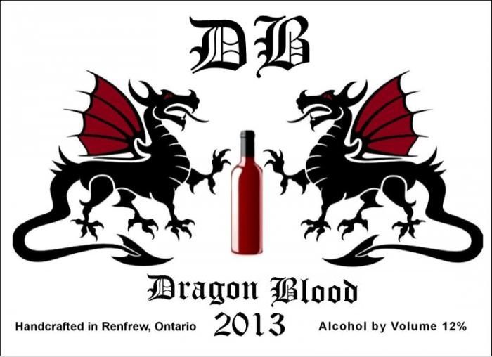
Please don't laugh at this! But constructive criticism and advice is much appreciated! This is my first stab at a DB label and was thinking of doing these a clear label on clear bottles or... If the white background is too harsh doing a beige "typical wine background" any suggestions?? Hopefully I can post the photo directly from my phone.  I found it hard to center the word blood as it's shorter... If this doesn't work I'll try again. Was trying to avoid having to post to photobucket
I found it hard to center the word blood as it's shorter... If this doesn't work I'll try again. Was trying to avoid having to post to photobucketckvchestnut
Senior Member
- Joined
- Sep 10, 2013
- Messages
- 1,428
- Reaction score
- 229
It looks to me like the DB could come to the right a bit... Don't know been playing with angles and positions for awhile! Eyes are playing tricks! And no it can't be the wine lol
- Joined
- Mar 1, 2009
- Messages
- 20,302
- Reaction score
- 2,223
I think the label looks great just the way it is. Good Job! Clear labels are tough to use since the color of the bottle or wine will play havoc with the colors'
ckvchestnut
Senior Member
- Joined
- Sep 10, 2013
- Messages
- 1,428
- Reaction score
- 229
Thanks so much Runningwolf! I obviously was going to add a few things here is my latestRunningwolf said:I think the label looks great just the way it is. Good Job! Clear labels are tough to use since the color of the bottle or wine will play havoc with the colors'
") Ok edit with final
Ok edit with final 
Attachments

Last edited:
ckvchestnut
Senior Member
- Joined
- Sep 10, 2013
- Messages
- 1,428
- Reaction score
- 229
Now I can tell the text on the abv is lower gotta fix!
You could always increase the kearning on the blood - spread out the characters a little bit to balance it. I think just a touch should do it so that it doesn't look that much different from the spacing on dragon.
ckvchestnut
Senior Member
- Joined
- Sep 10, 2013
- Messages
- 1,428
- Reaction score
- 229
Ok I think I've somewhat improved it by expanding the font on the Abv line and the blood line

Paradoxnightmare
Member
- Joined
- Jan 22, 2013
- Messages
- 41
- Reaction score
- 4
We drank almost all of my Skeeter Pee already. I supplied my brother's bachelor party and we polished off all but one beer bottle. I bottled them in beer bottles so I could let it carbonate and then pasteurize them. At 15% ABV it was a BIG hit.

Paradoxnightmare
Member
- Joined
- Jan 22, 2013
- Messages
- 41
- Reaction score
- 4

Here it is in action.
Mosquito Mojito.
Noontime
Custom Label Printing & Design
- Joined
- Oct 7, 2007
- Messages
- 746
- Reaction score
- 451
Great label Chestnut and great advice from others. As already stated, you've got a few design challenges that you're doing a pretty good job of dealing with. The first thing I noticed was the angle of the dragon and blood are not even when compared to the DB. It might look more symmetrical if that were more of a pyramid. Something different to try might be moving the dragons up and the "Dragon" and "Blood" below the dragon images; it might make it a bit more cohesive, and kind of name each of the dragons (if that sounds like a good idea to you of course). The smaller text could be combined to one line and create a foundation for the everything above. Just a thought. Have fun!Ok I think I've somewhat improved it by expanding the font on the Abv line and the blood line
View attachment 10934
ckvchestnut
Senior Member
- Joined
- Sep 10, 2013
- Messages
- 1,428
- Reaction score
- 229
Noontime said:Great label Chestnut and great advice from others. As already stated, you've got a few design challenges that you're doing a pretty good job of dealing with. The first thing I noticed was the angle of the dragon and blood are not even when compared to the DB. It might look more symmetrical if that were more of a pyramid. Something different to try might be moving the dragons up and the "Dragon" and "Blood" below the dragon images; it might make it a bit more cohesive, and kind of name each of the dragons (if that sounds like a good idea to you of course). The smaller text could be combined to one line and create a foundation for the everything above. Just a thought. Have fun!
Thanks everyone for the advice! Noontime are you suggesting that I put the words Dragon Blood flat under each dragon? Like the left one has dragon under it and the right one has blood? As far as the pyramid are you saying I should increase the angle of the dragon blood words and lower them so they line the center of the outside of the dragons? Your suggestions sound great however I'm a bit confused lol! I'm a visual person but I think with a bit more explanation I could figure it out!!
ckvchestnut
Senior Member
- Joined
- Sep 10, 2013
- Messages
- 1,428
- Reaction score
- 229
Ya and I'm no graphic designer by a long shot! Lmao I just thought I'd take a stab at doing my own I like to save money!
ckvchestnut
Senior Member
- Joined
- Sep 10, 2013
- Messages
- 1,428
- Reaction score
- 229
I love your label too! It looks Paleolithic kind of!! Actually what font is that? That was more the font I was looking for for mine! Kind of the dungeons and dragons feel!Paradoxnightmare said:Here it is in action. Mosquito Mojito.
Last edited:
ckvchestnut
Senior Member
- Joined
- Sep 10, 2013
- Messages
- 1,428
- Reaction score
- 229
Ok what do you all think of this modification? In the end I am think of printing either clear on clear bottles or a natural beige raw paper style label but still on clear bottles.  I thought I had posted the correct one but the dragon word wasn't centered but it was so nevermind the 2nd photo!
I thought I had posted the correct one but the dragon word wasn't centered but it was so nevermind the 2nd photo!Attachments

Last edited:
cedarswamp
Junior Member
- Joined
- Jul 1, 2012
- Messages
- 170
- Reaction score
- 29
Ok what do you all think of this modification?
Push the Dragon Blood together and center on bottle IMHO
ckvchestnut
Senior Member
- Joined
- Sep 10, 2013
- Messages
- 1,428
- Reaction score
- 229
cedarswamp said:Push the Dragon Blood together and center on bottle IMHO
Thanks! I'll try it and now you can see that the word dragon is a tad higher!
ckvchestnut
Senior Member
- Joined
- Sep 10, 2013
- Messages
- 1,428
- Reaction score
- 229
ckvchestnut said:Thanks! I'll try it and now you can see that the word dragon is a tad higher!
Ok how about this? I centered the top DB better as well

Similar threads
- Replies
- 7
- Views
- 1K
- Replies
- 15
- Views
- 2K
- Replies
- 2
- Views
- 1K