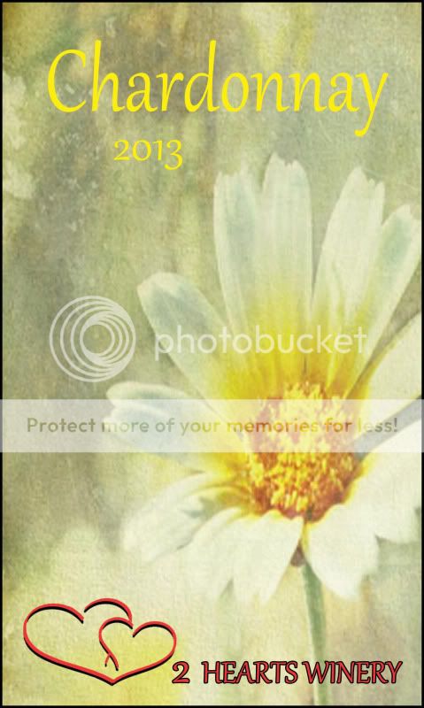
I like the logo a lot, might try running a yellow banner (same color as the Chardonnay) across the bottom and reversing the hearts and text in white out of the yellow. The Font is almost a script which is generally used Upper and Lower case, not all CAPS, might give it a little more professional finish. Just changing color might work too, maybe a burgundy, but I don't think you need the black outline around the text. The drop shadow on the Logo looks good though.
Nice Start, play with it till that little brain tickle that says something's not quite right goes away,
Mike


 2024 WineMakerMag Competition results are in.
 Marijuana surpasses alcohol in daily use for Americans, study finds


